Best Gaba Admin — Documentation
A free HTML, CSS & JavaScript admin dashboard template. No build tools, no frameworks — just open a file and go.
1. What is Gaba Admin?
Gaba Admin is a dashboard template built for people who want something that looks like a paid "pro" admin kit, but is free, easy to read, and doesn't force you into a build pipeline. There's no Webpack, no npm install, no compiling — every page is a plain .html file that pulls in one shared stylesheet and one shared script. Open index.html in a browser and the whole thing just works.
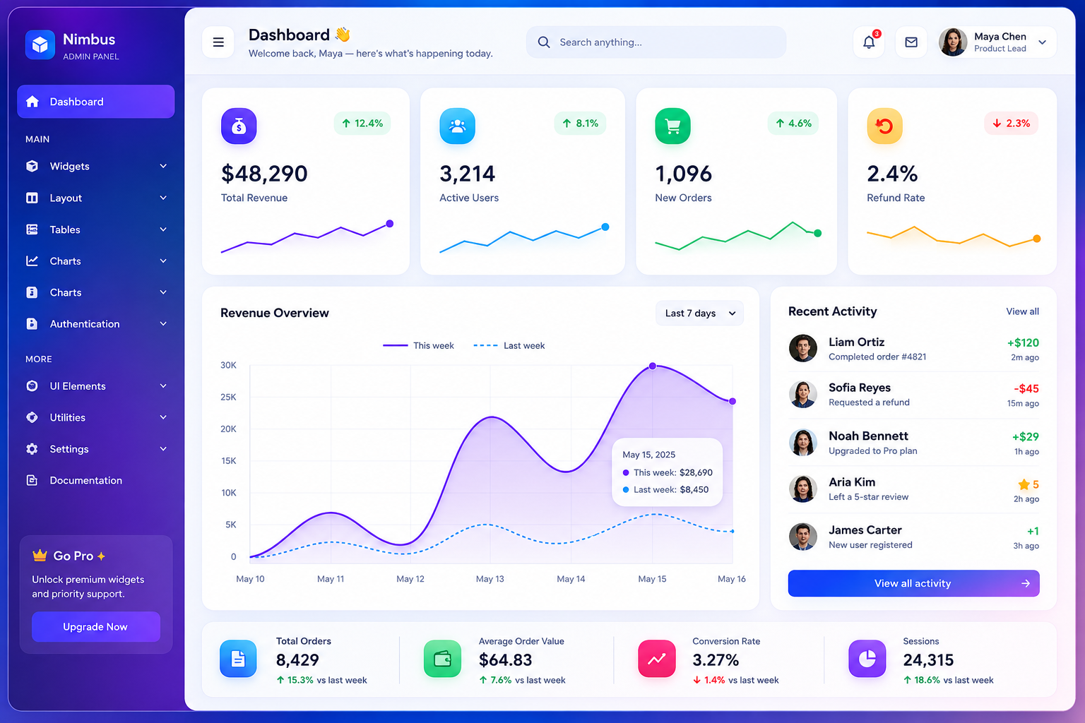
It's meant as a starting point: fork it, strip out what you don't need, wire the forms up to your own backend, and ship it. The signature visual touch is what we've been calling the "smoke glass" look — a frosted, blurred sidebar floating over softly drifting colour blobs in the background. It's subtle, it's not distracting, and it gives the template a bit of personality instead of looking like every other dashboard on GitHub.
This document covers everything in the box: the page list, the components, how the design system is put together, and how to customise it for your own project.
2. Feature Overview
Here's the short version of what's included:
- 15 ready-made pages — dashboard, data tables, forms, profile, mail/inbox, chat, calendar, widgets showcase, charts, two full layout variants, and three authentication screens
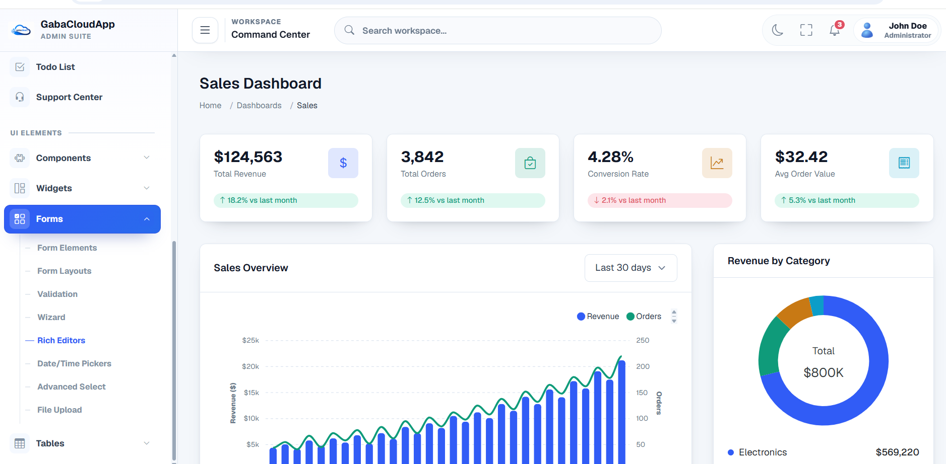
- Multi-level sidebar navigation with collapsible child menus (Widgets, Layout, Tables, Forms and Auth Pages all expand into sub-items)
- Fully responsive menu toggle — collapses the sidebar on desktop, turns into a slide-out drawer on mobile
- Working components, not just static mockups: sortable/searchable/paginated tables, a multi-step form wizard, tag-style multi-select dropdowns, accordions, modals, tabs, toasts, a functional month calendar, and a chat box that actually sends messages
- Two complete layouts — the default fixed sidebar layout, and a horizontal top-nav layout with hover mega-menus
- Auth flow pages — login, lock screen, and a logout confirmation screen
- Chart.js charts — line, bar, doughnut, radar, polar area and area charts, already themed to match
- A proper design system — CSS custom properties for colour, spacing, radius and shadows, so re-theming is a find-and-replace job, not a rewrite
Everything is vanilla JavaScript. There's no React, no Vue, no jQuery. If you know basic HTML/CSS/JS you can read every line of this template without needing a framework manual open in another tab.
3. File Structure
Gaba Admin-admin/
├── index.html Dashboard (default fixed layout)
├── tables.html Data table page
├── forms.html Forms, wizard, FAQ accordion
├── profile.html User profile with tabs
├── mail.html Inbox + compose modal
├── chat.html Chat template
├── calendar.html Month calendar + add-event modal
├── widgets.html Info boxes & card variants
├── charts.html Chart.js showcase
├── layout-fixed.html Explains/demos the fixed layout
├── layout-horizontal.html Alternate top-nav layout
├── login.html Sign-in page
├── lock.html Lock screen
├── logout.html Logged-out confirmation
└── assets/
├── css/
│ └── style.css Every style in the template lives here
└── js/
└── script.js All shared behaviour lives here
That's it. Two files (style.css and script.js) drive every page. If you want to change how something looks or behaves across the whole template, you almost never need to touch more than one of those two files.
4. Getting Started
There's genuinely nothing to install. Unzip the folder and double-click index.html — it'll open in your default browser and everything will render, because the external dependencies (Font Awesome, Google Fonts, Chart.js, Swiper) are loaded from CDNs rather than bundled locally.
If you'd rather serve it properly (recommended once you start wiring in real data), any static file server will do:
# Python
python3 -m http.server 8080
# Node (with the http-server package)
npx http-server .
Then visit http://localhost:8080.
One thing worth knowing: because fonts, icons and chart libraries load from CDNs, you'll need an internet connection the first time each page loads. If you're deploying somewhere with no external network access, download those libraries and swap the <link>/<script> tags for local copies — the markup and CSS don't care where the files come from.
External dependencies
| Library | Used for | Loaded from |
|---|---|---|
| Font Awesome 6.5 | All icons | cdnjs.cloudflare.com |
| Google Fonts (Sora, Inter, JetBrains Mono) | Typography | fonts.googleapis.com |
| Chart.js 4 | Dashboard & Charts page graphs | cdn.jsdelivr.net |
| Swiper 11 | Dashboard campaign slider | cdn.jsdelivr.net |
None of these are required for the layout itself to work — if a CDN is blocked, the page still renders, you just lose icons/fonts/charts until you point those tags somewhere reachable.
5. Design System
Every colour, spacing value, radius and shadow in Gaba Admin Admin is defined once, at the top of style.css, as a CSS custom property. This is the bit you'll touch most often if you're re-skinning the template for a client or your own product.
:root{
--bg:#F4F6FB; /* page background */
--surface:#FFFFFF; /* card/panel background */
--surface-2:#F5F7FB; /* input & hover backgrounds */
--text:#171B29; /* primary text */
--text-muted:#636D84; /* secondary text */
--accent:#6D4CF0; /* primary brand colour (violet) */
--accent-2:#0EA5C4; /* secondary accent (cyan) */
--success:#0FA968;
--warning:#CE8A03;
--danger:#E23B45;
--radius-lg:22px; /* card corner radius */
--font-display:'Sora',sans-serif; /* headings */
--font-body:'Inter',sans-serif; /* body text */
}
To re-theme the whole template, you really only need to change --accent and --accent-2 — buttons, active nav states, focus rings, chart lines and badges all reference those two variables rather than hardcoding a colour.
Typography uses three type families on purpose: Sora for headings and anything that should feel like a "display" moment (page titles, stat values), Inter for everything you read in paragraphs, labels and buttons, and JetBrains Mono for numbers — prices, stats, table figures — because tabular monospace digits are genuinely easier to scan than proportional ones.
The "smoke" background is three large, heavily blurred, slowly-drifting circles (.smoke-field span) sitting behind everything at low opacity. They're pure CSS (filter: blur() + a @keyframes drift animation), so there's no image asset to swap out — just change the three colours in the .smoke-field span:nth-child() rules if you want a different mood.
6. Page-by-Page Reference
Dashboard — index.html
The default landing page and the reference implementation of the "fixed" layout (sidebar + top bar pinned, content scrolls). Includes four stat cards with inline SVG sparklines, a live Chart.js revenue chart, a recent-activity feed, an auto-playing Swiper campaign slider, and an icon showcase.
Tables — tables.html
A fully working data table: type in the search box and rows filter live, click a column header to sort (ascending/descending), and pagination updates automatically. The delete icon on each row opens a confirmation modal before removing anything — nothing gets deleted by accident. A second, simpler team table sits underneath as an example of a table without search/pagination wired up.
Forms — forms.html
A personal-info form showing off every common input type (text, email, password with a show/hide toggle, textarea, select, checkboxes, radios, toggle switches, file upload), a tag-style multi-select for "Skills", a four-step setup wizard, notification toggle switches with a progress bar, and an FAQ accordion.
Profile — profile.html
A cover-photo profile layout with tabs for About, Activity, and Account Settings. Good template for any "my account" screen.
Mail — mail.html
An inbox list with a folder sidebar (Inbox, Sent, Drafts, Starred, Trash) and a Compose button that opens a modal with a multi-select "To" field — pick recipients from a checklist and they appear as removable chips.
Chat — chat.html
A two-pane messaging UI: conversation list on the left, message thread on the right. Type in the input box and hit enter (or click send) and your message actually appears in the thread — it's a genuine working demo, not just static bubbles.
Calendar — calendar.html
A real month-grid calendar generated in JavaScript from the current date, with colour-coded events and working previous/next month navigation. Events are seeded from a small JSON object in the page's data-events attribute (see the customisation section below for how to add your own). The "Add event" button opens a modal with a date/time form and a guest multi-select.
Widgets — widgets.html
A reference sheet of every reusable "block" the template ships with: info boxes (soft and solid colour variants) and six card styles — outline, flat, gradient, ribbon-badge, tabbed header, and a pricing card with a split footer. Copy-paste whichever variant you need into your own page.
Charts — charts.html
Line, bar, doughnut, radar, polar area, and area charts, all using Chart.js and already colour-matched to the template's palette.
Layouts — layout-fixed.html & layout-horizontal.html
Two structural options. layout-fixed.html is a demo/explainer of the default sidebar layout used by every other page. layout-horizontal.html swaps the sidebar entirely for a top navigation bar with hover-triggered dropdown mega-menus — useful if you want more horizontal room for wide tables or dashboards.
Starter — starter.html
A blank page with just the sidebar, top bar and footer wired up, and nothing else. This is the file to duplicate when you're starting a brand-new screen — it saves you from copy-pasting the shell out of index.html every time.
Auth pages — login.html, lock.html, logout.html
Standalone pages (no sidebar, since you're not logged in yet) sharing a centred .auth-card layout: a sign-in form with social login buttons, a lock screen with an avatar and a single password field, and a "you've been logged out" confirmation with a link back to sign in.
7. Component Reference
This section is for when you're building a new page and want to know what building blocks are available.
Cards
<div class="card">
<div class="card-head"><h3>Title</h3><span class="muted">Optional label</span></div>
...content...
</div>
Variants: add card-outline, card-flat, or card-gradient alongside .card for different fills. Add a .ribbon element inside a position:relative card for a corner badge.
Info boxes
<div class="info-box">
<div class="ib-icon violet"><i class="fa-solid fa-sack-dollar"></i></div>
<div class="ib-text"><div class="ib-value">$48,290</div><div class="ib-label">Total Revenue</div></div>
</div>
Icon colour classes: violet, cyan, green, amber, danger. Add .solid to .info-box (plus a colour class) for a filled, white-text version.
Buttons
.btn combined with .btn-primary, .btn-ghost, .btn-outline, or .btn-danger. Add .btn-sm for a compact size.
Badges
.badge plus .success, .warning, .danger, .info, or .neutral.
Tables / "datatables"
Wrap a <table> in a <div data-table> and the shared script automatically wires up search, sort, and pagination:
<div class="table-wrap" data-table
data-search="#tableSearch"
data-page-size="6"
data-pagination=".page-btns"
data-info=".p-info">
<table>...</table>
</div>
Add class="sortable" to any <th> to make that column clickable for sorting. Add data-delete-row to a button inside a row to have it trigger the delete-confirmation modal automatically (only works if #confirmDeleteModal exists on the page — copy it from tables.html).
Forms & the multi-select field
Standard fields use .input, .textarea, and .select-input, all wrapped in a .field for consistent label spacing. The tag-style multi-select looks like this:
<div class="multiselect" data-multiselect data-placeholder="Select options...">
<div class="ms-control">
<div class="ms-tags"></div>
<i class="fa-solid fa-chevron-down chev"></i>
</div>
<div class="ms-dropdown">
<label class="ms-option" data-label="Option One">
<input type="checkbox" value="opt1"> Option One
</label>
<!-- more options -->
</div>
</div>
The script fills in .ms-tags automatically based on which checkboxes are checked — you don't need to write any JS yourself, just repeat the .ms-option block for each choice.
Accordion
<div class="accordion">
<div class="accordion-item open">
<button type="button" class="accordion-head">Question <i class="fa-solid fa-chevron-down"></i></button>
<div class="accordion-panel"><div class="accordion-panel-inner">Answer text.</div></div>
</div>
</div>
By default only one panel is open at a time. Set data-single-open="false" on .accordion if you want panels to open independently.
Modals
<button data-modal-open="myModal">Open</button>
<div class="modal-overlay" id="myModal">
<div class="modal-box">
<div class="modal-header"><h3>Title</h3><button class="modal-close" data-modal-close><i class="fa-solid fa-xmark"></i></button></div>
<div class="modal-body">...</div>
<div class="modal-footer">
<button class="btn btn-ghost" data-modal-close>Cancel</button>
<button class="btn btn-primary">Confirm</button>
</div>
</div>
</div>
Clicking outside the box, pressing Escape, or clicking anything with data-modal-close all close it. Add .modal-lg to .modal-box for a wider dialog (used by the Compose modal on the Mail page).
Tabs
<div class="tabs">
<div class="tab active" data-tab="panelA">Tab A</div>
<div class="tab" data-tab="panelB">Tab B</div>
</div>
<div id="panelA" class="tab-panel active">...</div>
<div id="panelB" class="tab-panel">...</div>
Toasts
Call showToast('Your message here') from any inline script or event handler and a small confirmation toast slides up from the bottom-right for a couple of seconds. Any <form data-demo> shows one automatically on submit — handy for wiring up quick "Saved!" feedback before your real backend is ready.
Sidebar submenus
<button class="nav-item nav-parent" data-submenu="sm-example">
<i class="fa-solid fa-icon"></i>Parent Item<i class="fa-solid fa-chevron-down submenu-caret"></i>
</button>
<div class="submenu" id="sm-example">
<a href="page.html" class="nav-item sub">Child Item</a>
</div>
The script auto-expands and highlights whichever submenu contains the current page, so you don't have to hardcode "active" states by hand.
8. Customisation Guide
Adding a new page. Duplicate starter.html, rename it, update the <title> and the crumb-title / crumb-sub text in the top bar, then build your content inside the <div class="content"> block.
Adding a sidebar link. Copy an existing <a class="nav-item"> line inside the relevant .nav-group and update the href, icon class, and label. To make it a parent with children instead, follow the nav-parent / .submenu pattern shown above — just make sure the id on .submenu matches the data-submenu value on the button, and that both are unique on the page.
Changing the brand. The logo mark is a small gradient square with a Font Awesome icon inside it (.brand-mark); swap the icon class or replace it with an <img> tag if you have a real logo file. Brand name and tagline are plain text in .brand-name / .brand-sub.
Adding calendar events. Events live in a JSON blob on the calendar wrapper itself:
<div class="card" data-calendar data-events='{"7-14":[{"title":"Product launch","color":"green"}]}'>
Keys are "month-day" (month is 1–12, not zero-indexed), and each day maps to an array of events with a title and a color (violet, cyan, green, or amber).
Re-theming. As covered in the design system section — change the CSS variables at the top of style.css. If you want a genuinely dark theme instead of the current light one, the cleanest approach is to duplicate the :root block, invert the surface/background/text values, and toggle between the two variable sets with a body.dark-mode class (the template doesn't ship a dark mode switch out of the box, but the variable-driven structure makes adding one straightforward).
9. Browser Support
Built and tested against current versions of Chrome, Firefox, Safari and Edge. It leans on a few modern CSS features — backdrop-filter for the frosted sidebar glass, CSS custom properties, and CSS grid — so it won't render correctly on Internet Explorer or very old mobile browsers. If backdrop-filter isn't supported, the sidebar simply loses its blur effect and falls back to a solid translucent background; nothing breaks.
10. Known Limitations
Worth being upfront about, since this is a front-end-only template:
- Nothing is connected to a real backend — forms show a toast and stop there, the chat box only echoes your own messages, and the calendar's events are hardcoded in HTML rather than pulled from an API.
- Data (orders, team members, mail, chat history) is static markup, not fetched from anywhere — you'll need to template it from your own data source.
- There's no build step by design, which also means no bundling/minification. For a production deployment you may want to minify style.css and script.js and self-host the CDN dependencies.
None of this is hard to fix — it's just outside the scope of what a template can reasonably ship with. Think of Gaba Admin Admin as the front end for whatever backend you're already running.
11. Credits
- Icons — Font Awesome 6
- Fonts — Sora, Inter & JetBrains Mono, via Google Fonts
- Charts — Chart.js
- Slider — Swiper
- Avatar photos — Pravatar (placeholder images only, swap for real user photos in production)
12. License
Gaba Admin Admin is free to use in personal and commercial projects. Attribution is appreciated but not required. The bundled libraries above each carry their own licenses (all permissive/open-source) — check their respective sites if you need the exact terms for a specific use case.
Questions, bug reports, or requests for a dark-mode toggle? Reach out through the gabacloud.com contact page and we'll take a look.
What's Included
Server Requirements
Version History
- Initial release
- Core features included
- Full documentation